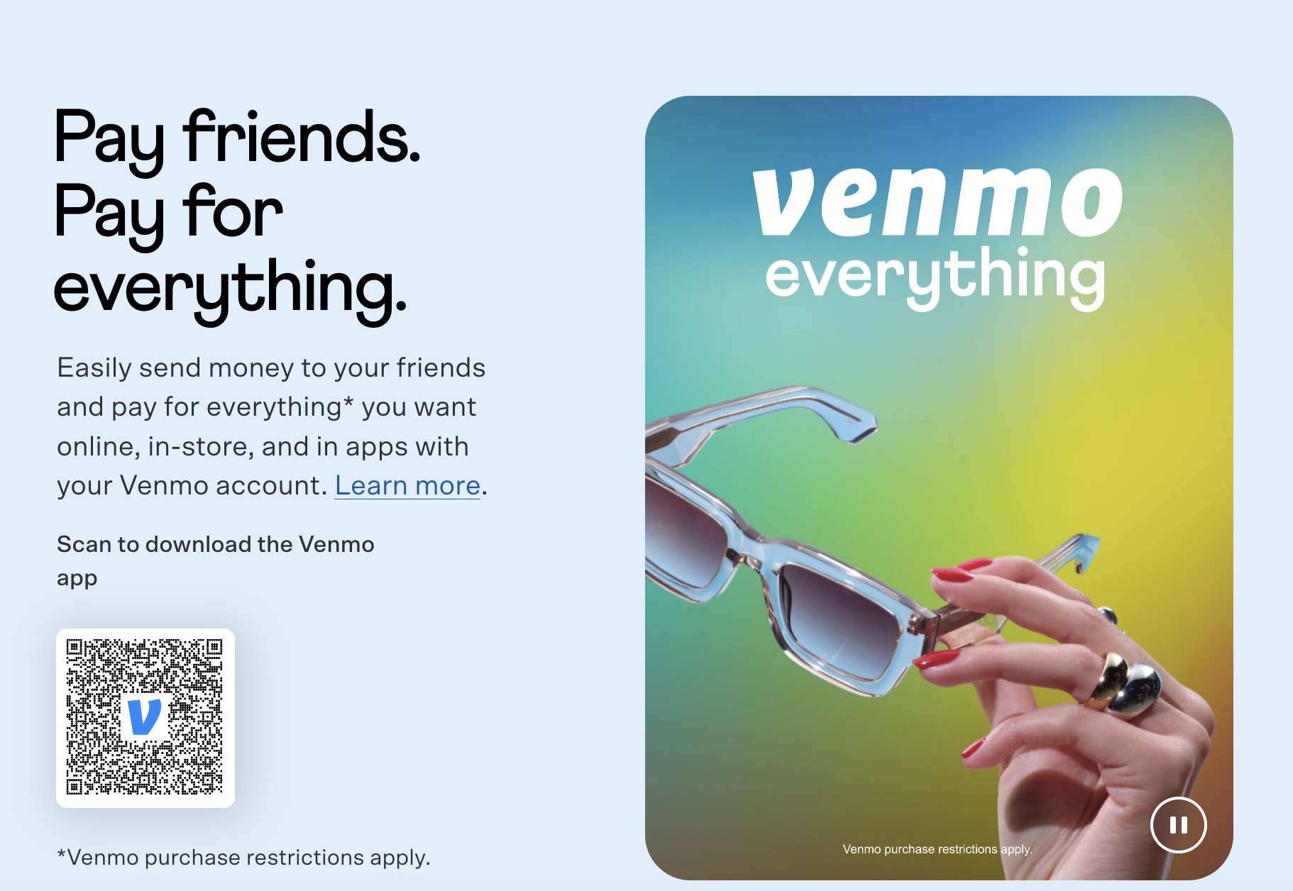
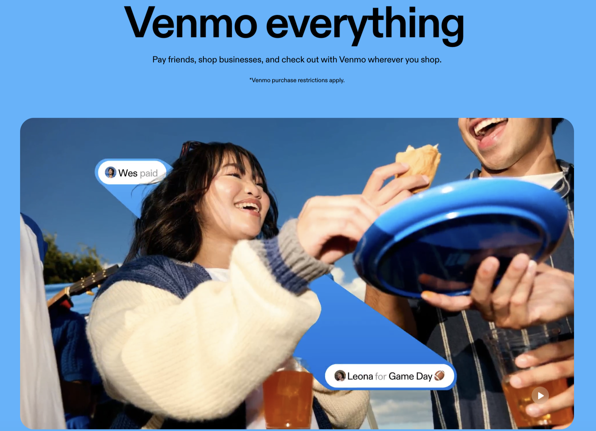
An updated UI style overlayed onto refreshed brand imagery to highlight the real ways people use Venmo to power shared experiences and co-create joy.
Brand Refresh
Reigniting preference and inviting reappraisal.
Opportunity
To evolve Venmo’s core brand identity to stand out in a crowded marketplace and match the company’s ambition to continue to define how the next generation moves money.
Solution
Venmo is a leader in the peer-to-peer payments space and a brand known and used by 90+ million people. But in the increasingly crowded fintech landscape, Venmo needed to remind customers of its value and invite them to use it for more than just paying friends back for dinner. To truly shift customer mindsets and continue to add value, our brand team got to work evolving the core value proposition and positioning, sharpening customer and cultural insights, and pushing the brand forward with a refreshed verbal and visual identity. Venmo’s rebrand has been a huge cross-functional effort two years in the making.
My contributions included:
Holistic brand architecture, value prop, positioning, and core messaging territories for testing.
Qualitative research inputs, personas, and customer insights development and socialization across teams.
Revised product value props and external messaging guides featuring copy thought-starters grounded in research-backed RTBs.
Lead brand stakeholder in agency reviews of new brand guidelines and assets; key collaborator with go-to-market teams working on a corresponding app redesign.
Rollout coordination across marketing and product teams and channels.
Brand training and foundational resources for new hires.
My role
In the rebrand: brand strategy lead.
Note: My role at Venmo began on the creative team as a senior copywriter. After advocating for more brand clarity and cohesion, I moved to the brand strategy team to create foundational resources like cultural calendars, design targets, and messaging frameworks.
The team
The in-house brand, creative, and experience design teams at Venmo, in partnership with an external design agency.
Process and results
The project began with research and discovery. We used the company’s three-year strategic plan to inform value prop territories for testing, aligned with cross-functional teams on an evolved value proposition, design target, and brand positioning grounded in what makes Venmo unique: not the transactions, but the stories and interactions behind every payment — the ever-moving currency for shared experiences and emotional connection.
Next, we collaborated with agency partners to develop a design signal from our finalized holistic brand value proposition: “life beats louder when our money moves through the people and brands we love,” with presentations to cross-functional teams and leaders to bring them along at key decision points. Then we got to work creating and implementing refreshed brand elements, including:
A slightly refreshed wordmark and updated monogram anchored in a new brand blue
A new proprietary typeface
An evolved color palette with expanded expressive range
Updated iconography, illustration, and 3D visual language
A new vibrant-candid photography style
A refined, easier-to-follow articulation of our brand voice
Brand guidelines for all elements and a cohesive brand ID
We are in the process of rolling out our newly refined brand elements and are monitoring the effects on brand health metrics as we go, paying special attention to opportunities for brand reappraisal.
above: before! a look at content hierarchy, strategy, and UX writing before the refresh: cluttered CTAs, hard-to-read headers, and inconsistent, outdated language to describe the brand.
below: after! a simpler topline message, visual and verbal indicators for quality media choices (“common Sense selections”), differentiation between marketing CTAs and trusted editorial content; a warm invitation to get to know the brand and what we stand for.


Telling our brand story
After the new homepage launched, we also created a 15th-anniversary Impact Report, a funder-focused microsite to expand on the brand story we introduced on the new consumer-facing homepage. We consulted with an agency to help us plan and build the microsite, and I was the primary in-house writer for the report, which charted Common Sense’s efforts from 2003–2018.